
If it’s time to rethink your current logo design or create a brand-new, first-ever logo for your company, you’re probably wondering where and how to start. You may also be thinking that the process will be a quick one-and-done, in-and-out experience. After all, at first glance, logos seem like they should be a simple and easy branding element to construct. It’s just a basic typemark and maybe a logomark, right?
Wrong.
Landing on the perfect logo that encapsulates your brand, speaks to your audience, and serves as your visual representation across all digital and traditional platforms where your brand is marketed requires several back-and-forths with your designer. Together, you are discovering the right combination of brand colors, fonts, and logo designs that communicates to all consumers, “This is my company, and this is our vibe.”
Why Does the Logo Design Matter?
Your logo will do more than inform your audience of your company name. It is going to set the tone for your business, communicating the energy consumers should expect from your business or brand. Ideally, the tone of the design will match the tone of your company. Otherwise, your audience may develop a sense of dissonance between your branding visuals and your actual brand.
For instance, a dog grooming business likely wants their logo to tell customers, “We take great care of your dog, and we have fun doing it.” The fonts, brand colors, and logomark should come together to convey this message perfectly, so the groomer is probably NOT going to go with the same fonts, brand colors, and logomarks you would likely find in logo of a law firm. A wealth management group probably wants a logo that tells clients “We are serious professionals who take excellent care of your finances.” So, you will not catch them with a logo that could be mistaken for a local bakery.
Logo Trends You Should Consider
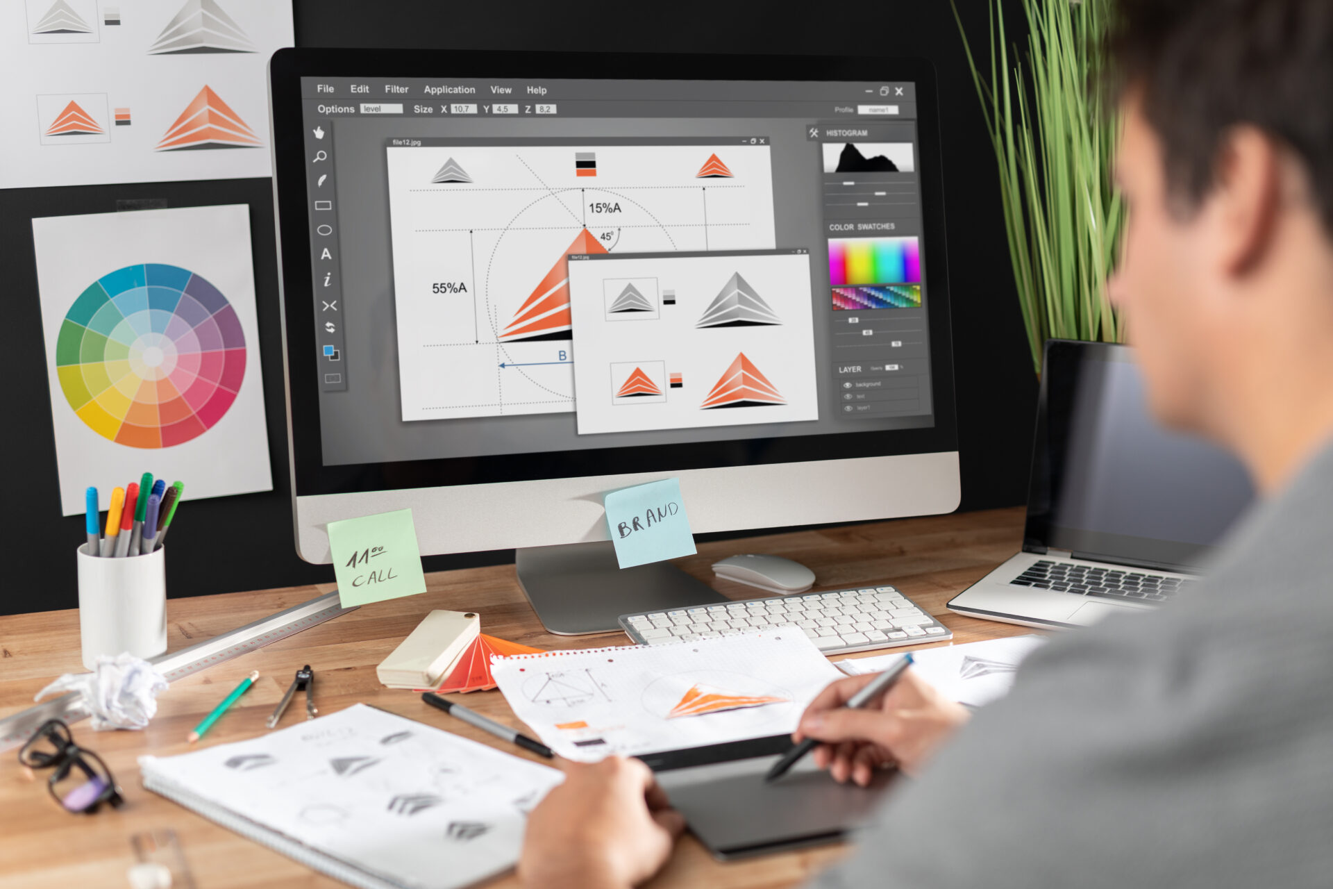
We’ve already dug deep into the reasons your logo design matters, so today we’re looking at the current logo trends that businesses are using to grab people’s attention and communicate their branding messages visually.
For the most part, businesses want an evergreen logo that can serve them for decades. Trends that are too modern may require a redesign sooner rather than later. However, there are classic and newer trends that each prove to be effective with audiences, such as:
1. Minimalistic Logo Designs
Minimalism in design is nothing new. Since the 1960s, it has been a popular and widely successful option for businesses. Like any trend, minimalism has ebbed and flowed in popularity for decades, but it is always served as a simple option that, when done well, is easy for audiences to recognize and remember.
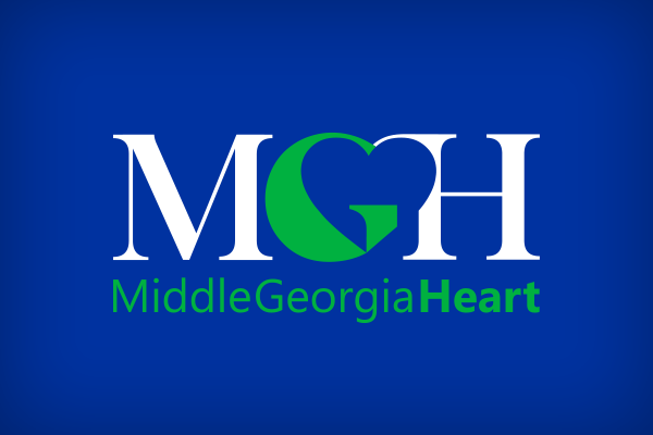
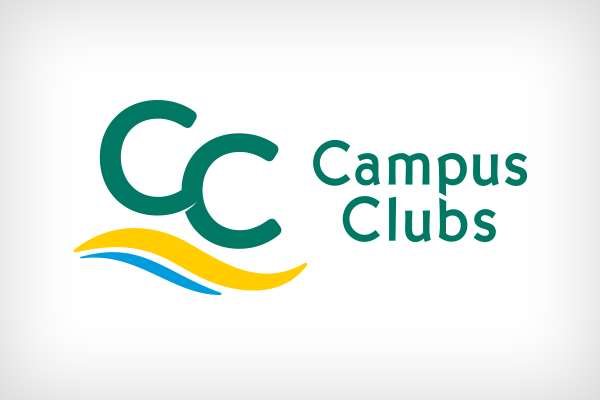
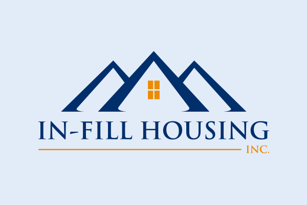
At M&R Marketing, we have produced many minimalistic designs for companies that have served them well since their creation. The following are minimalistic logos for Middle Georgia Heart, Capus Clubs, and In-Fill Housing, respectively.
2. Logo Mascots
Wendy’s. Reddit. Monopoly. Michelin. What do these brands all have in common? They all have mascot logos. As part of their logo design, these brands and others incorporate their mascots to help push brand recognition and connect audiences to the brand visuals better.
While the logo is the visual representation of a brand, the mascot is the physical embodiment of the brand. It is intended to be a “living” character that only exists to represent and promote the brand. Including it in the logo design only strengthens brand recognition and the connection made to the brand.
While mascots are a less-common branding element for small and midsize businesses, many are beginning to create and incorporate mascots into their marketing, including their logos.
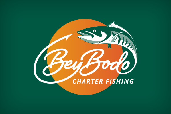
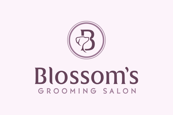
At M&R Marketing, we have designed numerous mascot logos for companies, including Bey Bodo, Foundational Wealth Advisory, and Blossom’s Grooming Salon.

3. Muted Colors
Brand colors can range from bright and colorful to black and white. However, there has been a distinct trend in using more natural color palettes rather than vibrant colors in branding, especially with brands that are marketed to adults. While the Lisa Frank and Lego logos go for bold with highly saturated colors to attract the attention of their younger audiences, many companies that are for adults are choosing color hues that are more natural and a bit more earthy.
Part of this is due to the more mature tone muted colors bring to a brand, and another part is due to the issue of working brand colors into the other pieces of a company’s marketing plan. While brand colors are crucial to the logo, they are also incorporated into the website, landing pages, display ads, social media ads, print pieces, and so much more. Muted colors are easier on the eyes and are more visually appealing, especially in digital spaces.
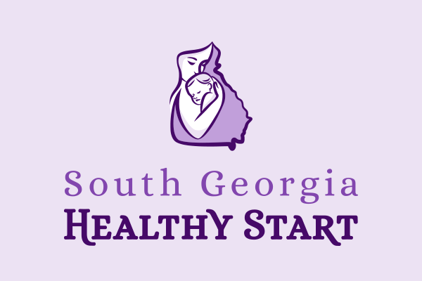
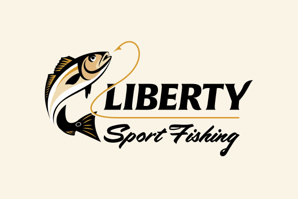
Take a look at the logo designs M&R Marketing created with muted colors for South Georgia Healthy Start and Liberty Sport Fishing.
4. Gradients
Along with muted colors, the gradients trend has taken off recently as a popular and effective way to design a logo and capture attention. Gradients are more of a modern option that gives off a contemporary feel. Think of the logos or icons for Meta, Instagram, iTunes, and Firefox. All are tech-related, and all use gradient designs to match the feeling of being forward thinking and cutting-edge like their brands.
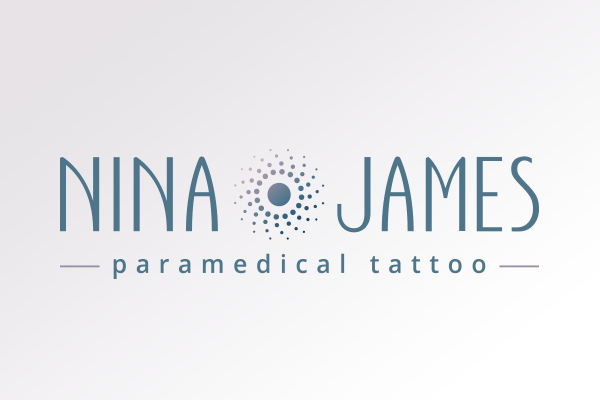
At M&R Marketing, we have created logos with gradients for companies like Nina James and Solomon, Deaton & Buice.
Our Graphic Designers Know Logo Trends and Can Design a Winning Logo for Your Brand! Call Us at 478-621-4491
When it’s time to create or rethink your logo, turn to the branding experts at M&R Marketing. Our graphic designers have created logos for companies across Georgia and the southeast and can create the branding visuals that communicate your message and tone quickly and efficiently to your audience. To start the logo design process, contact one of our friendly account managers today.
Did you love this article? Make sure you sign up for our monthly eNewsletter, so you never miss one.
We love good design, and we’re sharing that love this summer. From now through September, we’ll share tips, information, and best practices for using high-quality graphic design to build and promote your business.
Other posts in this series:
- 4 Ways Your Design Choices Can Help or Hurt Brand Perception
- Want to Spread Your Message? Don’t Ignore Your Message Design
- How Branding and Graphic Design Has Served Abbeville Commissioning in South Georgia
- How To Enhance Your Digital Ads with High-Quality Visuals
- What Do Your Brand Fonts Say to Your Audience?
- 4 Graphic Design Facts that Can Help Boost Business
- Does My Logo Design Really Matter? 3 Facts that Prove It Does