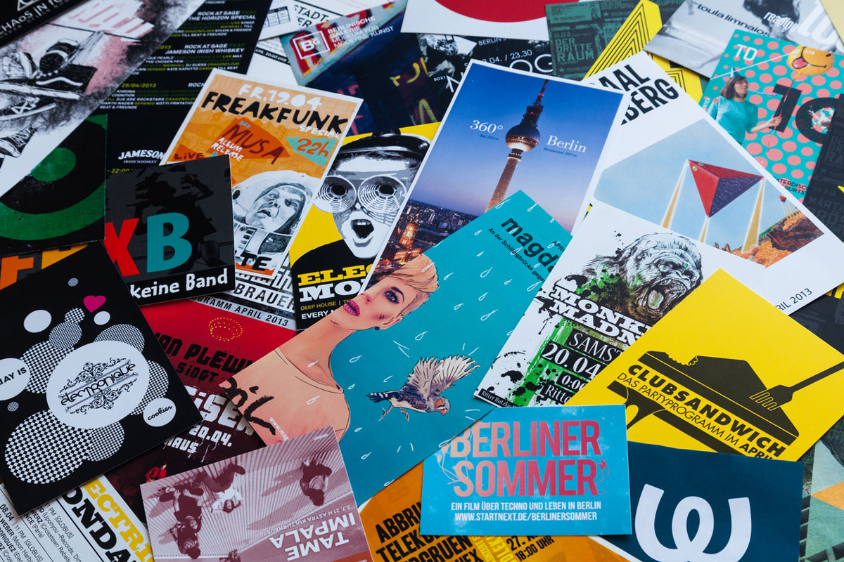
Print ads can include billboards, magazine advertisements, direct mailers, banners, and more. The possibilities are nearly endless. Differing from its digital advertising counterpart, print advertising is much more thought out using a curated approach. To reach and effectively communicate with your audience in 2021, your print ad’s content and design elements must work together to craft a powerful advertisement.
Whether you’re working with an 8.5” x 11” flyer or a 12’ billboard, you have a limited amount of space. You must focus on the most important information so the consumer can make an informed decision on what to do next. Usually, print advertising pieces need to answer the essential questions like:
- Who?
- What?
- When?
- Where?
- Why?
When you get straight to the point while staying true to your brand, you can deliver the information your consumer needs and strengthen brand loyalty.
Guidelines from Our Print Advertising Pros
M&R’s team of award-winning copywriters and designers are knowledgeable in best practices for creating eye-catching, conversion-driving print advertisements for our clients. Some of the guidelines you should follow when creating a print advertisement include writing clear and concise content including a call to action that stands out, strategically using headlines and subheadings, and balancing image/graphic, content, and white space usage. Guidelines will shift based on what type of advertisement you are designing, but they all still apply in some form.
Filling the Digital Gap
Although the digital universe is endless, the information is only useful when the viewer is accessing the Internet. Effective print advertising can meet them where they are when they’re not on the web. For example, billboards can relay information to them while driving, and branded flyers on restaurant walls can notify them about an upcoming event – two of many situations when your customer isn’t browsing the web.
Even further, print advertising can complement a message you’re pushing on the web, offering a cohesive and top-of-mind presence across all platforms – digital and print.
It All Starts with Content
Designing a print advertisement all starts with writing the content that will be included in the design. The content should be concise, easy to read, and convincing. Don’t use industry jargon or large, unnecessary words. There’s no need to be ornate – get to the point of what you want to say and what you want someone reading the content to do.
Creating a sense of urgency is important when crafting a call to action. Let readers know that what you’re offering is special, that they need it, and they need it now. If you effectively create a call to action and strategically place it where an internal decision is being made, it is more likely you will see results.
Make Sure It Flows
Utilizing headings, and subheadings if needed, is important for the reader’s experience interacting with your print advertisement. Keep your main heading short but informative without revealing too much about your business or ad content. This is likely the first thing someone reads when presented with your ad, so make sure your heading packs a punch and invites them to keep reading.
For longer format advertising, such as a magazine ad, subheadings are extremely useful. Designing subheadings below the main heading communicates a sense of hierarchy and structure to the content. If you really think about it, not everyone will take the time to read the ad in its entirety. By using informative subheadings, readers can scan the ad and understand what’s being communicated.
Your print ad should be designed to naturally flow with the reader’s eyes, making it easy to read and digest.
The Simpler, The Better
It’s important not to overload a design with images and graphics, especially when they are ancillary to content including a call to action or contact information. Strike the right balance between graphics, images, and fonts and using white space to your advantage.
Utilize White Space
White space can sometimes be more effective than a content and design-heavy print ad. Properly utilizing the white space in your design makes the end product easy to read and digest as well as offers an aesthetically pleasing visual.
A Word on Fonts
Font choice is also an important aspect in designing an effective print ad. Avoid font styles that you have to read twice to understand or make your design look crowded. Think about driving on the highway. There are so many billboards and you’re driving so fast, there’s only a short window to capture someone’s attention – make sure they can read it.
If nothing else, be sure to include concise content with an actionable step, a natural flow, and to not overcrowd the design for your print advertisement to resonate with readers and inspire a conversion.
Partner with M&R Marketing
M&R Marketing can help create a plan of action for creating effective, conversion-driving print ads of all types. When you hire us, you are choosing an in-house team of web developers, copywriters, account managers, digital strategists, and graphic designers who live and breathe marketing. We are creative, accessible, and dedicated to YOUR success. We’d love to partner with you! Send us an email at hey@mandr-group.com and we’ll get this conversation started.

