What is the number one goal for any business owner?
Growth.
Alongside delivering solutions to customers through your products or services, business growth is the name of the game. It’s what allows you to continue offering your solutions day in and day out to those who want what you provide.
If you operate a business in the great Peach City of Fort Valley, Georgia, whether it’s a utility company, law firm, construction company, retail store, healthcare facility, landscaping company, or any other type of business, chances are you are focused on growing your business as efficiently and strategically as possible.
There are hundreds of directions you can take to increase your brand awareness, customer base, profits, hold in the market, and so much more—one of the most effective ones is redesigning your current website or creating a new design if you don’t have one yet.
Even if you do not operate an e-commerce site, your Fort Valley business’s website is your online storefront. It’s what new customers often interact with first when they discover your brand. It’s what existing customers use when they want to explore the additional products or services you offer. It’s what referrals check out first when someone gives them your name as a solution to their questions or pain points.
Your website is immensely important for making an impression on potential and existing customers, and its design can either attract people to or repel them from your business’s digital spaces.
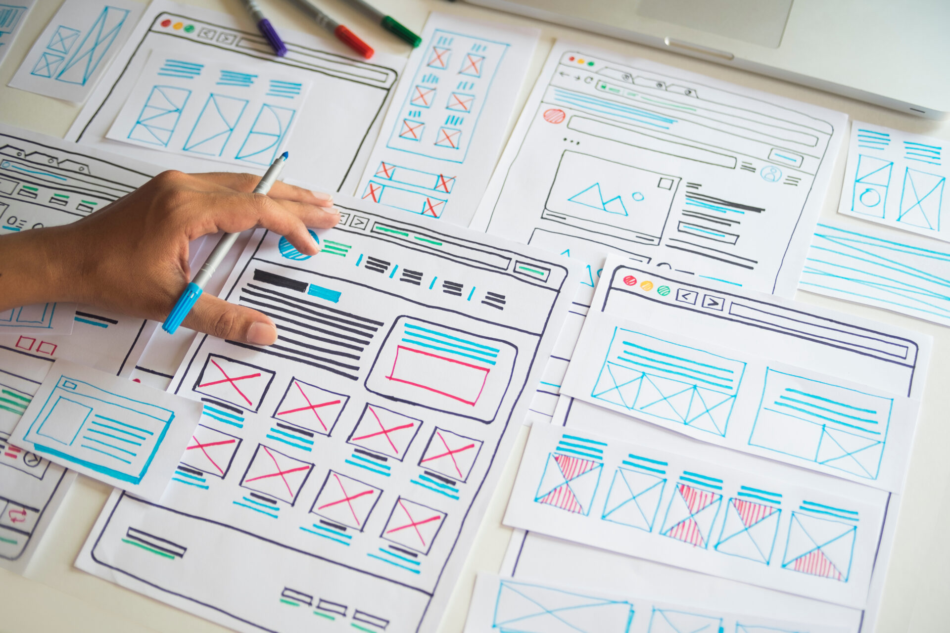
To help you think through a web redesign or brand-new build of your business website, let’s look at three crucial elements of web design so that you can make the most of your online presence.
1. Site Navigation

Website navigation includes all the interface components that allow visitors to explore your pages and, well, navigate your site. Think internal links, buttons, and website menus.
Every website has navigation. However, not every website has good navigation.
The way your navigation is designed can either make or break your site’s efficacy to users—it also plays a massive role in your SEO and site performance. Navigation impacts:
- Site traffic
- Average time spent on page
- Retention rates
- Session numbers
- Accessibility
- User-friendliness
- Brand perceptions
- Conversion rates
- Lead generation
Depending on whether your navigation is easy to follow or difficult to figure out, all of the above and more will likely flourish or plummet.
When your site navigation is poorly thought through, both users and search engine crawlers will notice and will react accordingly:
- 61% of users report that they will leave a website and find another if they cannot find what they are looking for in the first 6 seconds.
- 88% of users report that they would not return to a website following a negative experience.
- When site crawlers encounter a website with bad navigation, they will not rank the site as high in search results as those with good navigation.
How to Approach Your Site’s Navigation
If website navigation helps dictate whether users are going to have a positive or negative experience on your site, then employing navigation best practices is essential to keeping users on your site and guiding them toward conversion.
Your website’s navigation needs to be more than just easy to follow—it needs to be intuitive. You can make your site intuitive by implementing navigation best practices, which include:
- The simpler the homepage, the better. Don’t overwhelm users with tons of buttons, links, and menu items when they first land on your website. Instead, keep things simple with only a few clear call-to-action buttons (“Let’s Talk” that links to a form on your contact page, “View Products” that links to your products landing page, “Explore XYZ” that links to a specific service you want to promote, etc.)
- Design for mobile. We’ll say that again: design for mobile. A responsive website is crucial to your navigation. More than half of internet users access the internet on their phones, and 74% are likely to revisit a website that has a good mobile design. Users who interact with a desktop-centric website design on their phone will bounce away fast, or they will suffer through complex and frustrating navigation, developing a bad taste in their mouths regarding your website and your brand.
- Make navigation consistent from page to page. If your menu is horizontal on the homepage but vertical on your service pages, that is going to disorient your visitors. If your buttons look like rectangles on some pages but have a completely different shape on other pages, that will also disorient visitors and lead to negative reactions. Consistency is key.
There are dozens of additional things to consider for your website’s navigation, which a skilled team of web designers and developers can help you think through and perfect.
2. Content

Your content is the whole reason users visit your site. They want to know what you have to offer, which you can only convey through strong, solid content.
Plus, your content is what search engine crawlers use to index your site and rank it in relevant searches. The more relevant your content is to the search, the more likely you are to appear high on the results pages. The higher you appear, the better your chances are of the user clicking the link to your website and ultimately becoming a paying customer.
When it comes to content, you need to consider several factors:
- Informative – Does your content accurately convey who you are, what you do, and what you offer? Is it vague, or is it detailed? Providing the right message for your visitors is absolutely crucial to your efforts of converting visitors into actual customers.
- Concise – Is your messaging clear and to the point, or is your content so wordy that what you’re trying to say gets lost in the sauce of your copy? It’s better to be clear, simple, and to the point when it comes to your content—the more people have to work to understand you, the faster they will abandon ship and find a different site.
- Easy to Read – You need easy-to-follow content to keep users reading. The harder your copy is to read, the faster visitors will leave. You can offer easy-to-read content by displaying well-written copy that does not include spelling errors, grammar mistakes, elevated language, jargon, or anything else that interrupts flow and turns visitors off.
- Search Engine Optimized – Your content must have SEO value in order for your website to appear high on results pages for relevant searches. Optimizing your content with keywords and phrases, utilizing strategic blog articles, and updating your content with current information whenever necessary are just some of the ways you can add SEO value to your content and improve your performance on search engines like Google and Bing.
3. Visual Design

Design, design, design. Alongside your navigation and your content, your website’s design is one of the most effective parts of your website. Just like navigation, all websites have a design, but not all websites have a good one.
Humans are visual creatures. Here’s some proof:
- More than 90% of the information our brain receives is visual.
- The brain processes an image 60,000 times faster than it processes text describing the visual.
- 94% of a user’s first impression of your brand comes from the design they encounter.
- It takes 0.5 seconds for a user to develop a first impression of your website, and it’s all based on your visuals.
From your color choices to your layout, images, design elements, and everything else that goes into the design, they all play a part in attracting visitors who land on your site or turning them away from your website and brand as a whole.
Your website design choices tell your audience one of two things: you care about their experience with you, or you don’t.
One thing about web design and the visuals that make up your design is that they are not evergreen. General aesthetics and visual preferences evolve and change. As a result, web designs are continuously evolving, which means your website’s look is not evergreen—it’s going to need to be regularly updated, as well.
It’s important to update your web design whenever necessary to keep it from appearing outdated. Remember what Facebook looked like in 2004? Profiles were extremely boxy with sharp-angled sections and other visual elements that are super out-of-touch with the softer, rounder aesthetic preferences of today. Now, imagine if Facebook had never changed with the times and still looked the same as it did when it was first launched. Or, imagine if it reverted back to its original design all of a sudden. Users would react, and not in a positive way.
However, while it is important to monitor your website and update the design whenever necessary to ensure your look matches current trends, remember not to get too trendy.
Design trends can be tricky to navigate. What may have been popular just a few years ago is likely old news and has been replaced by newer, more updated designs, functions, or overall concepts.
Right now, several trends are catering to newer visual preferences. For instance, ultra-clean, simple, minimalistic visual elements used to be preferred on a website. But now, many companies are in the process of transitioning to maximalist designs to match the new preference for louder, fuller, busier visuals.
Keeping up with design trends is good and necessary to an extent. However, the smartest move to make with your web design is to keep it aesthetically pleasing, easy to digest, and more timeless than overly trendy. Following trends too much can overwhelm users and turn them away from your website.
There Is So Much to Consider When Thinking Through the Crucial Parts of a Website for Your Fort Valley, GA Business. For the Most Effective Strategies, Rely on the Web designers at M&R: 478-621-4491
Our in-house team of web developers, web designers, and copywriters work with clients in Fort Valley, Central Georgia, the entire state, and beyond to create stunning, effective websites that attract users and promote business growth. From writing and designing your website to developing it, hosting it, and updating it when necessary, we have your website needs covered from the start.
Contact one of our business development managers today to discover how your website can boost business in Fort Valley and beyond.
Did you love this article? Then sign up for our monthly eNewsletter so you never miss one.
Detailed Marketing Deets
Want some profound insight into all things marketing? Check out our Definitive Guide Series for detailed information, tips, and advice regarding:

